Tag Archives: Ocean

The saline waters that covers three-fourths of the earth’s surface.

Ocean Acidification 2021

This is my fourth and final post on the 2021 report: Climate Change: The Physical Science Basis by the United Nations International Panel on Climate Change. I promised four posts covering ocean warming, sea level rise, salinity changes, and finally the subject of this post – ocean acidification. Acidification sounds scary doesn’t it? You might imagine a big rolling sea of water that can burn your skin off. It’s not that bad, but it’s still somewhat frightening. Now I don’t mean to scare people through my blog, that’s big media’s business. I want to inform people who don’t have the time to read thousands of pages of scientific documents about their contents. My blog posts are designed to provide you with a nuts and bolts synopsis of critical water issues plaguing the world today. But sometimes the data can be pretty worrisome.

So let’s get the scary bit out of the way shall we. The IPCC report points to the oceans absorption of carbon dioxide since the 1980s as being in the range of 20 to 30 percent of all human carbon emissions. As a consequence the pH of the ocean surface has declined 0.017 to 0.027 units per decade since the 1980s and subsurface pH up to a mile in depth have declined by 0.003 to 0.026. If you want to know more about how carbon dioxide impacts ocean pH you can find it here https://waterblogger.org/general-information/ocean-acidification-climate-change/ .

You may be asking yourself why such a small decline in pH is so scary. We have to do some chemistry to explain. As the ocean water absorbs carbon dioxide from the air a chemical exchange occurs, producing carbonic acid – H2CO3. The carbonic acid dissociates, generating HCO3 and H+. What this means is that carbonate ions (CO3) in the water are decreased and bicarbonate (HCO3) ions are increased. It basically changes the whole carbonate chemistry of the ocean. You might not care but all the little critters that make their shells from calcium and carbonate in the ocean’s water do.  Calcium carbonate saturation rates of seawater have been declining at rates of 0.07 to 0.12 per decade.

What I find particularly fascinating in the 2021 IPCC report though is the variation in pH decrease that has been measured in different parts of the ocean now, for example the tropical Pacific Ocean is decreasing in pH at a greater momentum than other ocean areas, while the western tropical Pacific Ocean (renowned for its warm pool of water) shows slower pH declines. Coastal areas are acidifying at a greater rate than elsewhere as waters there are supersaturated with carbon dioxide. What’s happening at depth is interesting too. The well known meridional overturning circulation zones, such as the one in the Atlantic Ocean characterized by the Gulf Stream, bring warm water from the lower latitudes into the Polar Regions where it cools and sinks thereby producing acidification in the deep ocean. Areas like the subpolar North Atlantic Ocean and the Southern Ocean have the highest acidification found at depths greater 2 miles.

Governments are busy trying to decrease carbon dioxide emissions. The results will reverse ocean acidification at the surface, but not at depth due to the long time scales of ocean turnover. This will result in a lasting legacy in the deep ocean and impact biological resources for thousands of years to come.

Ocean Salinty and Climate Change

Ocean salinity is not a topic people often think about when it comes to climate change. After all why in the world would the salinity of the oceans change just because human produced greenhouse gases like carbon dioxide are accumulating in the atmosphere and the ocean? There’s a simple answer to this question though and I explained it in a detailed blog post about six years ago. You can read it at your leisure ( https://waterblogger.org/general-information/ocean-salinity-climate-change/  ). The short answer for the sake of brevity in this post is that greenhouse gases are causing the atmosphere to warm and warm air holds more moisture resulting in increased rainfall. If the amount of rain exceeds the amount of evaporation then a body of water becomes fresher and if there’s more evaporation than rain the water becomes more saline.

 This is all measurable and scientists have been measuring atmospheric water vapor since the 1970’s. It is raining more over the Pacific Ocean where there is already a lot of warmth with accompanying atmospheric moisture and it is raining less in the mid latitudes of the Atlantic Ocean. The Pacific Ocean is becoming less salty and the Atlantic Ocean saltier. Scientists in fact have been measuring the very dickens out of the oceans saline content. There are measurements through the Soil Moisture and Ocean Salinity (SMOS) satellite system and ARGO’s 2000 plus ocean based floating instruments. The latest 2021 International Panel on Climate Change report entitled Climate Change: The Physical Science Basis indicates that between 1950 and 2019 trends in near surface ocean waters have shown strengthening of the contrast between high and low salinity areas of the ocean. The report quantifies the increase in contrast as 0.14 parts per thousand. This is up slightly from the 0.13 parts per thousand reported in the 2013 IPCC report of the same name.

So what if some parts of the ocean are getting saltier and others are getting fresher? Who cares? Well scientists are concerned that changes in salinity will affect the density of ocean water as higher saline content results in denser water while fresher water is less dense. Ocean density is already being impacted by temperature changes. Cold water is denser than warm water. Certain deep water circulation patterns in the oceans are dependent on dense surface water sinking in the polar regions, for example the Atlantic Meridional Overturning Circulation (AMOC). AMOC brings warm surface water from the equatorial region of the Atlantic Ocean to the northern Atlantic where it cools, sinks and is transported back towards the equator. It’s like a big conveyor belt in the ocean. Scientists say that AMOC impacts the climate of the Northern Hemisphere but they seem quite uncertain as to how. They suspect it keeps conditions a lot warmer in the Northern Hemisphere than it would otherwise be. But all they really know is what is measurable and what is measurable is that AMOC is weakening. This makes sense if polar waters are warming and denser saline waters in the middle latitudes of the Atlantic are not being transported to the poles breaking the chain of the Atlantic Ocean circulation. If you live on the east coast of the United States you are probably familiar with AMOC as it includes the Gulf Stream which moves warm water from the Gulf of Mexico along the coast of the United States and Canada then on up to the Northern Scandinavian countries. Scientists are also uncertain as to what exactly is going to be the result of a weakening AMOC. There is of course a lot of speculation by researchers often based on what occurred in the geologic past when AMOC weakened. The IPCC report though does not take a position on the veracity of the various studies purporting to know exactly what happened when AMOC weakened in the past nor are they even a hundred percent sure if the weakening of AMOC is being caused by climate change. The IPCC report says that the record is too short to determine if weakening of AMOC is natural variability or driven by climate change. So I won’t speculate either, I’ll leave that to the popular press.

Sea Level Rise from Climate Change

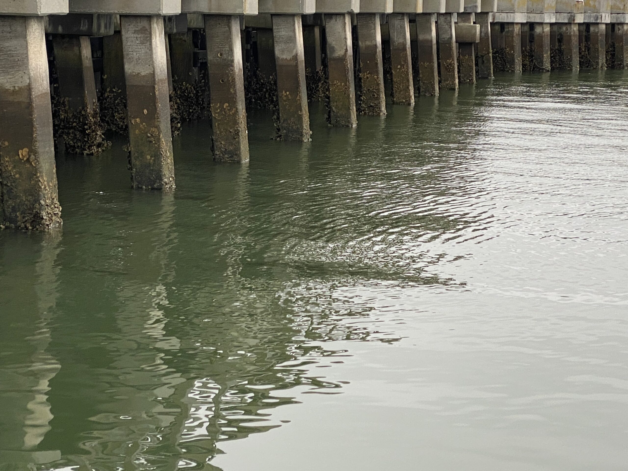
High water marks on a bulkhead

I read a story in the newspaper a few weeks ago about how the governor of Florida was visiting Miami in order to start the long process of providing protection from sea level rise to the low lying city. It was an interesting article; because in addressing the issues caused by sea level rise, like coastal inundation and flooding, he wouldn’t let the words climate change pass his lips even though the issues have expensive solutions like sea walls and drainage infrastructure. I’m not a political person but it seems strange to me that the guy won’t address the root cause of the problem and is only interested in temporary fixes. Sea level rise is becoming an acute problem all up and down the eastern seaboard of the U.S. wherever development has occurred along the coast. I live on an island where gauges to measure sea level have been installed to track the inevitable encroachment of the ocean. I’m afraid our community won’t exist in 50 years as no manner of temporary fixes will keep the island from disappearing.

Six years ago I wrote a blog post on the rising oceans (https://waterblogger.org/general-information/sea-level-rise-climate-change/ ). At the time scientists used satellite measurements to show there was a 0.03 inch yearly rise of sea level as the result of greenhouse gas emissions. Increased monitoring since then has produced a lot of new and better data, so let’s take a look at what the just released 2021 report from the United Nations International Panel on Climate Change Climate Change 2021: The Physical Science Basis has to say about sea level changes.

Here are the yearly sea level rises given in the 2021 report:

PeriodAverage Rate of Sea Level Rise in Inches per Year
1901 – 19710.05
1971 – 20060.075
2006 – 20180.15
Data from 2021 UN IPCC Climate Change 2021

What can we make of this new data? Simple math indicates that over the last 12 years of monitoring sea level has risen 1.8 inches and the total sea level rise from 1901 to 2018 is estimated at close to 7.9 inches. My last blog post based on the 2013 IPCC report on the physical science basis for climate change had an estimate of a 7.5 inch rise over the time period between 1901 and 2013. So we’re not talking about a huge increase in 8 years, but you can see from the table above that a continuous sea level rise is going on and that the rate of the rise is increasing on a yearly basis.

Why is sea level rising so quickly? Sure glaciers are melting and the Greenland Ice Sheet looks like swiss cheese because it has so many holes in it, but according to the 2021 IPCC report glacial melt has only caused about 41 % of the sea level rise between 1901 and 2018, although it is projected to increase as the loss of ice sheets is really beginning to take off and now accounts for 35 % of the sea level rise that has occurred between 2006 and 2018. The other reason for the sea level rising is simply good old fashioned thermal expansion. When you heat water, it expands. The 2021 IPCC report estimates thermal expansion is causing 38 % of sea level rise.

Other factors playing into higher sea levels are density and circulation changes in the ocean; however the 2021 IPCC report fails to quantify their contribution. I find it hard to believe because there are a multitude of other facts and figures given, but really the report just doesn’t say. There’s often a failure to communicate in the IPCC report caused chiefly by omissions like this one but also because so many different time periods and measurements are compared. It’s a hard slog to get through the whole report and garner any useful information. My literary critique aside, the changes caused by thermal expansion (thermosteric changes) and density changes from increased salinity (halosteric changes) are lumped together in the 2021 IPCC report as “steric sea level change.” These two changes actually should be working at cross purposes to each other, as greater density decreases volume whereas higher temperatures increase volume. I would take exception to how they are presented in the report, except in reality the halosteric changes are negligible.

So this is probably more complex than you ever thought and then to put even more of a spin on things (excuse the pun) sea level rise is not the same everywhere due to the earth’s rotation and gravity. In other words your sea level rise in Thailand is not going to be the same as it is in say New York City because water is sloshing around and mounding up differentially.

What is causing the sea level to rise is probably not as important as the projections in the 2021 IPCC report for future changes in sea level. The 2021 IPCC report provides two different calculations for future sea level rise: one projection is for the scenario of greenhouse gases being substantially reduced and the other is for a scenario where they continue to be emitted at high levels. Compared to the time period between 1995 and 2014 calculations show that in 2150 global mean sea level will rise by about 2 feet for the low emissions scenario and by 55 feet in the high emissions scenario. Unfortunately the world is now beyond the tipping point of totally eliminating sea level rise because heat in the surface of the ocean is slowly circulating into the deeper parts of the ocean and will be retained there, causing thermal expansion for thousands of years to come.

Ocean warming -climate change

I wrote my first blog post on ocean warming in 2016 (https://waterblogger.org/general-information/increase-in-ocean-temperatures-climate-change/). Almost six years have passed so let’s take a look at the state of the science in determining how our planet’s oceans are responding to the additional heat being transferred to them from the atmosphere. Conveniently the latest report from the International Panel on Climate Change (IPCC) just came out in 2021. It is entitled Climate Change 2021: The Physical Science Basis and is written in a much different style than the last IPCC report of the same name issued in 2013, because the science of climate change has grown. There’s a lot more certainty among scientists about what green house gas emissions from human activities are doing to our planet because there has been substantial data collection from a global network of monitoring systems over the last decade. Even the climate models have been updated and the predictions are now more useful. The bulk of the 2021 IPCC report is geared toward risk. In other words what is going to happen to this planet if it continues to warm and more importantly to readers of this blog, what is going to happen to the oceans?

The report uses a period between 1850 and 1900 as a reference period for comparison to today’s temperatures. You may recall those years were the beginning of industrialization. Scientists can now say definitively that global surface temperatures in 2021 are 2.1 degrees Fahrenheit higher than the time between 1850 and 1900.    

I wrote about ARGO in my very first post on how warming is affecting the oceans (https://waterblogger.org/general-information/oceans-and-climate-change/  ). ARGO is a system of floating scientific instrumentation deployed in the oceans around the world. The instruments measure, among other things, ocean temperature. The array of monitors has helped scientists determine the ongoing increases in ocean heat content in at least the upper 6500 feet of the ocean where measurements are being taken. Below 6500 feet there’s just not much data. But in the upper 6500 feet things are really warming up because these are the ocean depths where the ocean is storing heat from the atmosphere. Back in 2013 studies estimated that 90 % of earth’s energy caused by global warming since the 1970s is being stored in the ocean. New calculations say 91 %. Not much change there, but ARGO has been able to further refine for climate scientists where among the various depths of the ocean heat storage is concentrated. As you can imagine the first 3000 feet of the ocean is taking the big brunt of the action with 61 % of the total. This is important to realize because mixing and transfer of heat among the ocean layers is very slow. Later on in this blog post I’ll tell you why this is so important, but first a few more facts and figures for you from the report.

As everyone knows by now the three main greenhouse gases that are drivers of climate change are carbon dioxide, methane, and nitrous oxide. Carbon dioxide, which is in large part responsible for warming temperatures, is being exchanged and buffered by the ocean. Buffering is when carbon dioxide interchanges chemically with the water at the ocean’s surface to form a new compound – a weak carbonic acid. The ocean is taking up not only most of the heat from the atmosphere but is at the same time storing and reducing the amount of carbon dioxide. Carbon dioxide increases have been measured to be about 1.56 ppm a year over the last 61 years. During this time the accumulation of carbon dioxide in the atmosphere has remained about the same – 44 %. Why? Because the carbon is being taken up by the oceans and by the plants and soils of the planet. The circulation within the ocean slowly moves the carbon from the surface into deeper parts of the ocean.   

Scientists measure carbon in PgC. One PgC is equal to a billion metric tons of carbon. That’s a lot. The calculation of the cumulative amount of carbon dioxide from human activities that has been stored in the ocean is about 105 PgC. Do the math. Total human emissions of carbon dioxide are estimated to be 450 PgC. So the ocean is taking up 23 %. The fascinating thing that has been calculated in the 2021 IPCC report is when exactly the ocean will lose its buffering capacity for carbon dioxide. This is a mere chemical calculation, nothing special. Here’s the result: the ocean should be able to uptake carbon dioxide from the atmosphere through 2100, but its capacity to buffer will start decreasing around 2050.

What does this mean? It means that more carbon dioxide will remain in the atmosphere. For decades half of carbon dioxide has been taken up by the ocean and terrestrial carbon sinks and has slowed warming of the atmosphere. In 2050 the atmospheric temperatures will start to rise. You think its hot now, just wait.

And for the oceans? Average ocean temperatures today have increased by 1.6 degrees Fahrenheit from the reference period of 1850 to 1900. Since the 1970s, heat transfer to the oceans has increased by 0.28 – 0.55 yotta joules. No that’s not lotta joules; it’s yotta joules. Although it seems like a lot of joules to me. This a very large number, greater even than my calculator can handle. Take 0.28 and add 24 zeroes behind it. The 2021 IPCC report estimates that in the future ocean heat is likely to increase by 2 to 4 times that amount and 83 % of the ocean surface will warm over the 21st century. And here is what I told you earlier that I’d reveal later in this post. Even if green house gas emissions are drastically cut back, ocean warming will continue until 2300 because of the slow circulation between the upper and lower ocean depths.

So there you have it, the dystopian future of the oceans is sealed.

First Contact: Climate Change

I can envision the future when aliens first arrive in 2150 to contact humanity. Gyzzzzlbex and Azzterixx stop at the United Nations building in New York City for a meet and greet.

            Gyzzzzlbex looks around and says, “Hey Azzterixx I don’t remember all this water covering up the city. I know it’s been two hundred years since we last visited this planet, but I’m sure there wasn’t this much water here then.”

            Azzterixx replies, “And where are all the people? I didn’t see a soul when we were on the way down here in our space ship. This planet was heavily populated when we last visited.”

            “Maybe they killed themselves off with those nuclear bombs they were testing in the desert when we had that hard landing in Roswell, New Mexico.”

            “Nah,” says Azzterixx, “My monitor doesn’t show any radiation.”

            “Well maybe there’s something here in the United Nations headquarters that will tell us what happened.”

            The two aliens look around in the various rooms and find a library.

            Azzterixx picks up a weighty tome, browses through it, then says, “Well look here Gyzzzzlbex, this document says that it is unequivocal that humans have warmed the atmosphere, ocean and land of this planet through release of green house gases and that there have been widespread and rapid changes to the atmosphere, oceans, cryosphere and biosphere as a result.”

            Gyzzzzlbex walks over to where Azzterixx is standing and tries to read over his shoulder. “What is that big book you are quoting from?”

            Azzterixx says, “It’s called Climate Change 2021: The Physical Science Basis. It’s by some panel of experts here at the United Nations called the International Panel on Climate Change. And holy cow it is 4000 pages long.”

            Gyzzzzlbex says, “How about turning the page there Azzterixx.”

            Azzterixx does so and they both inhale sharply.

            “So that’s what killed them all,” says Gyzzzzlbex.

            “Yes and they calculated it all out in this report. Amazing. They knew if they didn’t drastically cut green house gas emissions that the global surface atmospheric temperature could rise by as much as 12 degrees Fahrenheit by 2100. How sad. Well I guess our mission here is done.”

            As the aliens turn to leave Gyzzzzlbex says, “I wonder why they did nothing to stop green house gas emissions, knowing what they did?”

            I wonder too. I read the news coverage of the recent United Nations Climate Summit in Scotland which reported of a consensus among scientists and environmental organizations that the agreement reached there by some 200 countries will not be enough to mitigate greenhouse gases impacts on our climate. It’s been since January 2016 that I’ve written anything on how climate change is impacting the oceans, so I thought I’d take a hard look at the scientific research presented by the IPCC report on Climate Change: The Physical Science Basis just issued in 2021 versus the report by the same name from 2014. I wrote four posts on climate change in 2016 that covered:  ocean temperature changes, sea level rise, and ocean salinity. So I’m going to follow that process again in this blog to let long time readers catch up with the current science. Here is a link to the first post I wrote in 2016 (https://waterblogger.org/general-information/oceans-and-climate-change/ ).

Copper and Water Quality

A few of my readers know that I’m a sailor. My husband and I have a 32 foot sailboat, which we keep it in a marina on the Chesapeake Bay. Every year the boat gets hauled out of the water for the winter. Before the boat went back in the water this year, we had the hull painted. Copper based paints are used on boat hulls to prevent the growth of critters and sprouts. I was curious about how copper paints prevent your hull from becoming a Noah’s ark of algae and barnacles, so I have been doing a little reading on the subject. There have been a number of copper based paint studies (also grandly called Anti Fouling Systems) conducted by the U. S. Environmental Protection Agency (EPA) and the California Environmental Protection Agency (Cal-EPA). According to the two environmental organizations, the most commonly used boat paints leach copper into the water and form a toxic protective shield around the boat hull to prevent the attachment of aquatic organisms. Copper is a toxin for many aquatic plants and animals. In fact it is a toxin for many terrestrial plants and animals. Copper is a widely used pesticide in the agricultural industry where it’s employed to eliminate bacteria, fungus, and weeds.  After a few years, the leaching rate of copper from the paint on a boat hull decreases and the boat has to be painted once again. It costs a couple of thousand dollars every time, so this is not an incidental expense.


The most common form of copper in the antifouling paints is cuprous oxide.  I didn’t realize how much copper is actually in the paint. Cuprous oxide paint is 30 to 60 percent copper. So a lot of copper is going into the water in marinas where recreational boats spend most of their time. The Navy actually did some studies in San Diego Bay back in the 1990s and found that 98 % of the copper in the bay came from antifouling paints on boats. They calculated that each boat in the bay was releasing 1.8 pounds of copper a year just while they were sitting at the dock in the marina. According to the Navy, most of the copper in the paint was released through the leaching process. A smaller amount of copper was released during underwater cleaning of boat hulls. California does seem to have the largest problem with copper in the waters of their marinas, so much so that a marina in California has been listed as an impaired water body under 303(d) of the Clean Water Act. Once a water body is listed as impaired under the Clean Water Act, a state must institute a Total Maximum Daily Load (TMDL) for it. A TMDL basically sets the maximum amount of a particular pollutant that a water body can receive and still meet water quality standards. As you can imagine, the designation of the marina as an impaired water body has now posed a serious problem for the marina’s boaters and California’s environmental regulators. Since hull paint is considered the main contributor of copper into the marina’s waters, the Cal-EPA has instituted a study of alternate antifouling systems – hull coatings without copper – in hopes of finding one which will be effective and economical enough to be used on recreational boats so that water quality there can be improved.


The water quality criteria established by the EPA for copper in marine waters and estuaries is really quite low. It has been revised multiple times over the last 20 years. The revisions have sought to produce a more scientifically justified approach for the development of the water quality criteria. The latest approach in setting the copper water quality criteria was issued in the July 2016 draft guidance: Aquatic Life Ambient Estuarine/Marine Water Quality Criteria for Copper, EPA-822-P-16-001. Scientists at EPA have known for many years that the toxicity of copper in water is dependent upon the water’s salinity (the amount of dissolved solids in the water), the temperature, the pH (the measure of acidity), and the amount of natural dissolved organic carbon. EPA scientists realized variations in these parameters influence the amount of dissolved copper in water. Dissolved copper is the culprit in the metal’s toxicity to aquatic organisms. Toxicity is reduced when copper in the aquatic environment binds with other elements and organic carbon to form ligands. Ligands are a little difficult to understand but simply put, they are complexes of molecules binding together to form a new substance. So for example, if there’s a lot of natural dissolved carbon in the water, it might bind with copper to form a ligand. Copper can also form complex ions with other ions and ligands in the water. Copper tied up in ligands and complex ions is not available to plants and critters, thereby making the water less toxic to them.


Interestingly copper has a similar binding behavior when it interacts with aquatic organisms. It binds to the biota’s gills and surface membranes. Although biota also ingests copper in the water, the scientists at EPA do not consider it a pathway for the toxin to negatively impact the organisms. It is the binding of copper to the gills and surface membranes of marine fish and invertebrates which is the major factor in coppers toxicity to them. EPA has a name for it. They call it the biotic ligand. Therefore to take into account the complexity of the world at large which is obviously not a simple system, EPA has developed a model called the “Biotic Ligand Model” to determine based on the specific temperature, pH, salinity, and amount of dissolved carbon what the aquatic criteria is for any particular marine or estuarine environment you might encounter. This makes it a little tough for state regulators because then they must sample the waters in question for these parameters and run a complex computer model to determine the specific water quality criteria for any given water body.


When setting water quality criteria, EPA usually bases it on the organism in the water which is most sensitive to a given pollutant. Arthropods are pretty sensitive to copper, after all the reason boaters use copper paint is to keep barnacles from attaching to their boat hulls. Although in the grand scheme of things I don’t think anybody is really worried about barnacles. Commercial species of mollusks like mussels, oysters and abalone are also extremely sensitive to copper. EPA was able to collect acute toxicity data on 89 different estuarine and marine fish and invertebrates. In simple terms acute toxicity means that biota aren’t going to live very long when exposed to an acutely toxic concentration of a pollutant. There were far less data available on chronic toxicity. Chronic toxicity happens when exposure to a pollutant results in conditions which are not immediately fatal to an organism, for example reproductive anomalies (we call these birth defects).


With EPA’s Biotic Ligand Model one can pop the temperature, pH, dissolved carbon and salinity values of your local marine/estuarine water into the model and come up with a numeric value for copper which should not be exceeded. So for example, if your water is 68 degrees Fahrenheit, the pH is 8, the dissolved carbon is 1.0 milligram per liter, and salinity is 32 parts per thousand than dissolved copper shouldn’t exceed 2.0 micrograms per liter on average more than once every 3 years, and the 4 day average shouldn’t exceed 1.3 micrograms of dissolved copper per liter more than once every 3 years. Complicated right?


These are extremely low values. The current acute value for copper is 3.1 micrograms per liter and the chronic is 4.8. The water quality criteria are of course guidelines. They are not regulatory in nature. They are there for state regulators to use in determining protection measures for aquatic life. As mentioned above, California has already designated a San Diego area marina as an impaired water body. Other places EPA has suggested might have copper levels impacting aquatic life are certain locations within the Chesapeake Bay and some port areas of Florida. As of yet, I know of no other marinas which have been designated as impaired waters. Alternatives to copper paint are fairly expensive and can potentially double the price for applying an antifouling coating to a boat hull. The American Coatings Association and the International Copper Association have already commented on EPA’s 2016 draft guidance. The organizations submitted a number of technical comments in regard to the Biotic Ligand Model and the conservative values produced by it. They are worried that the new proposed copper water quality criteria will result in unrealistically low TMDLs for other marinas.

Ocean Condition: Assessing the Fish

Questions, questions, there are always questions. The big question about my review of the Environmental Protection Agency’s (EPA) January 2016 “National Coastal Condition Assessment 2010” report was “how did the EPA determine the majority of coastal fish in the United States were in fair to poor condition?” My last blog post (if you didn’t catch it, here’s the link https://waterblogger.org/water-quality/ocean-condition/) said EPA rated the majority of fish in coastal waters as fair (26.4 % of fish) to poor (49 % of fish) due to the amount of selenium in the fish tissue. It is a fair question about what constitutes such a rating. So I went back to EPA’s technical report which provides all the methodologies for the data produced during the study. It was also released in January 2016, as a companion piece to the “National Coastal Condition Assessment 2010” report.

EPA has been using a standard process for examining toxicity in fish for the two decades they have been producing reports on coastal conditions. The method used examines the whole body tissue of a fish. When I used to work on ecological risk assessments, we referred to this method as the bassamatic. EPA of course refers to the process as homogenization. Basically you put the fish in a blender or other sort of grinder. I know this presents an unpleasant image, but it is important that your sample for analysis is going to represent what the wildlife out there is actually eating. My understanding is the fish are generally in a frozen state before they are blended and these are not your kitchen blenders anyway, as they typically have titanium blades to prevent laboratory contamination of the sample. Once the fish samples are prepared, they are tested for a number of natural contaminants, including selenium, mercury, cadmium, and arsenic. They are also analyzed for a number of persistent organic contaminates like the pesticides toxaphene, mirex, lindane, endrin, endosulfan, dieldren, DDT, and chlordane. They are also analyzed for other persistent organic contaminants hexachlorobenzene (a fungicide), heptachlorepoxide (a degradation compound of the pesticide heptachlor), and different molecular weight hydrocarbons. Persistent is “environment talk” for organic chemicals that don’t readily degrade and stick around causing endless problems. Fortunately most of these are no longer used in the United States.

Next EPA sorted through a multitude of scientific laboratory studies conducted to establish contaminant concentrations that pose risks to birds, mammals, and fish. There’s currently a huge body of scientific work in this area. EPA wrote the guidelines for conducting ecological risk assessments way back in the 1990s and scientists have been developing data on fatal and sub-lethal contaminant exposure to wildlife ever since. You know that old saying “Whatever kills you makes you stronger?” Well it is definitely not true in the world of toxic contaminants. Sub-lethal in the case of toxic contaminants can have a variety of very nasty consequences for wildlife. Here’s your word for today: teratogen. A teratogen halts or deforms the development of an embryo or fetus. This is a sub-lethal effect.

Environmental scientists don’t use the terms lethal and sub-lethal. They use the terms acute for lethal and chronic for sub-lethal. The concentration of a contaminant known to have a toxicological effect on a wildlife species is called the Toxicity Reference Value or TRV for short. Because nobody wants to have a toxicological effect on wildlife, scientists generally look at only the exposure concentrations that show no observed adverse effects (NOAEL) on wildlife or the low observed adverse effects (LOAEL) on wildlife.

For the national coastal study, EPA looked at a variety of wildlife that all eat fish and developed a generalized NOAEL and LOAEL for the contaminants analyzed. I’m going to use two of the contaminants for comparison: selenium and arsenic. Most people when they think of arsenic, they’re thinking poison, right? Well look at this:


Birds Marine Mammals Marine Fish


Selenium NOAEL 0.27 0.15 11.04
LOAEL 0.53 0.24 14.75


Arsenic NOAEL 3.39 0.08 0.06
LOAEL 8.51 0.4 0.3


The numbers you see are in milligrams per kilogram or parts per million (ppm). For a bird the low observed adverse effect of selenium is at 0.53 ppm, while the low observed adverse effect of arsenic is 8.51 ppm. Selenium has a more toxic effect on birds than arsenic does. Marine mammals also have a low TRV for both selenium and arsenic.

But remember now, EPA is examining the condition of the fish and what the toxic impacts are on the birds, mammals and fish that are eating them, not at what level a particular wildlife species starts having toxic effects. They had to calculate what amount of a contaminant in a fish would pose a risk to birds, marine mammals, and marine fish. So they got their fish tissue NOAEL and LOAEL for the toxic impacts by taking the TRV for wildlife species, multiplying it by the general body weight and dividing it by the general amount of fish ingested. Yes they really did this. I know it sounds complicated and frankly the whole process makes my head hurt, but they came up with some figures they could screen fish for and say whether they were in good, fair or poor condition.

Here are the selenium numbers EPA developed for their report:


Contaminant Bird Marine Mammal Marine Fish
Fish Tissue Fish Tissue Fish Tissue
NOAEL LOAEL NOAEL LOAEL NOAEL LOAEL
Selenium 0.29 0.57 259.68 428.48 11244.05 15016.72

These figures are again in milligrams per kilogram. Marine mammals like dolphins and seals and marine fish like tuna, shark and swordfish have larger body weights than birds so they can eat fish with a lot more selenium in them before they begin to have toxic effects. Birds also have a greater ingestion rate – they eat more just to keep their body weight up. I guess it takes more calories to fly than to swim around or walk.

So there you have it. EPA established their screening criteria for what constituted fair and poor fish quality based on the consumption of fish by birds.

Ocean Condition

For a while now, I have been writing about changes to the earth’s oceans as a result of climate change. I’ve felt adrift in the ocean environment, having primarily worked on terrestrial surface and groundwater issues. So I prepared to launch myself into a vast number of research papers on ocean water conditions to update myself on the current science. Fortunately for me, EPA’s “National Coastal Condition Assessment 2010” was published in January of 2016. The report, although issued somewhat tardily, is a great snapshot of coastal water conditions in the U.S. and saved me from months of reading dry, poorly written journal papers. I was able to shift with the wind and set sail on a short excursion of only 103 pages to find out the condition of coastal waters in the U.S. EPA defines coastal waters as the estuaries, bays, wetlands, swamps, and open waters along the coastlines of the U.S.


This is EPA’s third assessment of the ocean waters of the U.S. The first two assessments were conducted in 1999/2000 and 2005/2006. So now, there is a ten year history of coastal water condition assessments. You can do a lot with this kind of data. You can see what the trends in water quality are. Is water improving or getting worse? If so why is that happening? And if it is getting worse, what further water programs do we need in the U.S. to stop coastal water degradation. After all it’s the activities here on terra firma that are affecting our coastal waters. We all learned rivers drain into oceans years ago in elementary school. Everything we do here on the ground eventually ends up in the ocean. Our wastewater treatment plants dump the treated sewage water back into our rivers, which then flow into the oceans. Our agricultural runoff and city storm water drainage all end up in the river and flow down to the sea.


EPA measured the condition of coastal waters using four different methods. First they looked at the health of biological communities living in coastal waters. Specifically they collected and counted the number of benthic organisms. Benthic organisms are the creepy crawlies hanging out in the sediment at the water’s bottom. You know these guys – worms, clams, that sort of thing. If they exist in large quantities then you have good coastal water conditions; ditto for surface water too. If you go into a stream and turn over a few rocks and don’t find some creepy crawlies underneath them, you probably have water quality problems. The existence of benthic organisms is an important indicator of the overall health of any water body.


Second they looked at the water quality itself and they used all those parameters which are used on terrestrial surface waters to determine if they are in good condition – nitrogen, phosphate, dissolved oxygen, water clarity – and additionally something called chlorophyll a. Chlorophyll a is the stuff that makes plants green. If you have a lot of chlorophyll a in coastal waters, it’s because you have a lot of algae. Too much algae means too many nutrients. It also means you probably have low dissolved oxygen at the bottom of the water where dead algae accumulate and start to “stank”.


The EPA also looked at sediment quality in their report. They had two measures for determining sediment quality: sediment contaminants and sediment toxicity. You’d think if you had the one, you’d have the other right? Well it doesn’t necessarily work that way. You can have low amounts of contaminants, but if you have contaminants the creepy crawlies really don’t like (especially in the fatal range of don’t like) that’s all it takes to end up with poor sediment quality. EPA collected sediment samples from the bottom of coastal waters and sent them to laboratories to be analyzed for metals, polyaromatic hydrocarbons (PAH), polychlorinated biphenyls (PCBs), organochlorine pesticides, and total organic carbon. The results are EPA’s measure of sediment contaminants in coastal waters. EPA also took the sediment and put it in a tank with ocean water in the laboratory. They then threw into the tank some different kinds of amphipods to see how they fared. Amphipods are these nearly microscopic creatures that look like shrimp but aren’t. They are scavengers which means they grub around in the sediment looking for dead things to eat. Basically the amphipods hang out for about 10 days in the tank. Some of their friends and family are put into another tank in the laboratory with nice clean sediment (this tank of amphipods is called the control.) After the 10 days, scientist count how many amphipods are left in the tank with the contaminated sediment and in the control tank. There are measurement standards for this sort of thing and the scientists can calculate based on the mortality rate of amphipods what the sediment’s toxicity is.


For its fourth and final measure of coastal water conditions, EPA analyzed fish tissue for contaminants. Not for the level of contaminants that are of concern to humans who eat fish, but for the level of contaminants of concern for wildlife that eat fish.  Humans eat fish just a few times a week, if at all.  Wildlife like otters, osprey, minks, and herons are eating fish all day long, every day of the year. Fish are their main food source.


EPA’s report covers the total coastline of the U.S., including the Great Lakes. Unfortunately this is the first year the Great Lakes were included in the study, so I’m excluding the Great Lakes’ data from this post, because there is really nothing to which the current condition of the coastal waters of the Great Lakes can be compared. For their report, EPA has divided the coastline into the Northeast Coast (from Maine to Virginia), the Southeast Coast (North Carolina to Biscayne Bay in Florida), the Gulf Coast (west coast of Florida all the way to the border of Texas with Mexico), and the West Coast which includes Washington, Oregon and California. That’s a lot of coast line; 35,400 square miles to be precise. And only 1,104 sites were sampled. When I saw that low number, I gave the whole study a wary eye. How could data from such a small number of sites adequately reflect coastal condition? Here’s how EPA does it: a statistical method is used which is similar to those used in political surveys. This kind of sampling methodology provides a statistically valid estimate with a known confidence level. Coastal sites can’t just not answer their phone, right? So such a survey should be even more precise than a political poll. Well not exactly. Unfortunately there is a lot of missing data, where scientists went out and tried to catch a fish at a particular study site, but couldn’t get one. Or a scientist couldn’t collect a sediment sample at a site because the site location was on a rocky coast. It depends on the coastline as to how much data is missing. EPA is working on improvements in data collection for their current 2015 report. But even with missing data there are still some clear trends, especially if you look at the individual coasts.


For example along the Northeast Coast only about 44% of waters were rated as having good quality, mainly because of the amount of phosphorous in the water. The amount of phosphorous in the water has increased on the Northeast Coast since the last survey in 2005/2006. Sediment quality has also deteriorated since 2005/2006, mostly due to sediment toxicity. Only 60% of the sediment sites sampled were rated as good quality sediments. However, the sediment toxicity doesn’t seem to be affecting much of the biological communities which have stayed about the same.


Coastal water in the Southeast is only rated good for about 21% of the sites sampled in 2010/2011. Frankly coastal water quality in the Southeast is just not very good due to the amount of phosphorous in the water. These waters are actually worse than those in the Northeast. Sediment quality has also decreased in the Southeast because of an increase in the amount of contaminants found in samples during 2010/2011 sampling. The Southeast sediment quality is rated good at about 65% of the sites sampled. Biological communities are only rated good at about 60 % of the sites sampled and really they haven’t changed much in the last 10 years.


It gets worse when you look over at the Gulf Coast. The Gulf coast hands down has the worst water quality in the U.S.  Only about 16 % of the sites sampled have good water quality. The culprit again is phosphorous. Water quality has declined significantly over the last 10 years because of increasing amounts of phosphorous. And the Gulf must be absolutely wracked with algae based on the chlorophyll a amounts, which are the highest of all coastal waters in the U.S. Not surprisingly sediment toxicity increased for the 2010/2011 assessment. A rather notable event occurred in April of 2010 when the Deep Water Horizon exploded and leaked oil into the Gulf for almost 3 months. There was a 15 % decline in good sediment quality among the samples taken in 2010 compared to the samples taken in 2005/2006. The EPA report states the biggest decreases in sediment quality in the Gulf were in the oil spill area as a result of sediment toxicity. However the EPA report can’t directly link the oil spill to the increase in sediment toxicity because of the limited contaminants the Agency samples for in these periodic coastal assessments. It’s a head scratcher, but then there are probably better studies out there related to the impacts of the Deep Water Horizon oil spill. One of the interesting findings is that biological communities on the Gulf floor actually increased from 2005/2006 to 2010/2011 – by a lot. The good rating went from 24% to 60 %. That is a significant change which is explained in the report as being a result of missing data from 2005/2006. Apparently 47% of sites were not sampled for benthic data during that timeframe.


The West Coast has the best water quality in the U.S. Some 64% of coastal waters there were in good condition. Again the big contributor to water degradation was phosphorous. There was a lot of missing sediment data; 19 % of sites were not sampled. In my book, that is probably too much missing data to really say much about the overall quality of sediments on the West Coast. There are a lot of mixed results from year to year for the West Coast. For example there was a 25% decline in water quality rated good between the 1999/2000 and the 2005/2006 event and then a 15 % increase in waters rated good quality from 2005/2006 to 2010/2011. Biological communities rated good showed a big decrease in 2010/2011 from 2005/2006, but then again there was a lot of missing data from 2010/2011; 21 % of sites were not sampled. So I find the changes a little suspect.


The other measure EPA looked at was fish. There were no coastal areas rated good for fish. Basically most of the fish were rated in poor condition: 42 % on the West Coast, 69 % in the Gulf, 57 % from the Southeast Coast, and 33 % on the Northeast Coast. The fish on every coastline of the U.S. are contaminated with selenium, mercury and arsenic to such an extent that they are simply not good for the wildlife in those areas to eat. EPA made the surprising assessment that it is selenium which is the most widespread contaminant exceeding fish tissue contaminant levels harmful to wildlife.


There are a couple of serious take aways from this report. One, all of our coastal water have a serious problem with phosphorous levels. Two, significant numbers of coastal fish have so much selenium in them that they are not healthy for the wildlife to eat.


Both phosphorous and selenium are natural elements which are widely distributed in soils and rocks. Phosphorous also comes from phosphate rock which is mined and processed for phosphate fertilizer. Phosphate fertilizer is applied to lawns and agricultural fields and without sufficient water management is carried into our streams and rivers as runoff. Interestingly selenium is also found in phosphate rock. Selenium runoff has been of great concern at the phosphate mines in Idaho. But selenium has many other sources too, including coal. EPA does not speculate on the source of the selenium found in the fish tissue.

Sea Level Rise – Climate Change

Sea level rise is probably the most well known impact to oceans from climate change. For those of us who live in low lying coastal areas, it has become the daily dirge we hear from environmental groups, state environmental agencies, and the media: “prepare for inundation by the ocean, prepare for inundation by the ocean.”  Just last week there was yet another public talk in my town about preparing for sea level rise. It may be too late for my town; we get water in the streets every time there is a high tide. Many a time, I’ve had to wear rubber rain boots in order to get to stores and restaurants on the waterfront. It’s kind of like Venice, Italy, where residents keep their rubber boots by the door during “acqua alta.” However our problem is not simply caused by sea level rise from climate change. There are other problems accosting us, like subsidence of the whole area due to what is called isostatic rebound from former glaciers in the area. So we are getting the double whammy. We have seen almost a foot of sea level rise in the last hundred years. How do we know? Well people have been monitoring tide gauges for literally hundreds of years.


Scientists have estimated that global mean sea level has risen by 7.5 inches since 1901. They have based their estimate on records from tide gauges around the world and since 1993 on satellite data. Of course most of the tide gauge records are from Europe and North America. Did you know that the Europeans were installing and measuring tides in the 1700’s? The oldest tide gauge in the United States was installed in San Francisco Bay in 1854. There are long records of tide heights. The problem is sorting all the data so you are not seeing effects of isostatic rebound and other contributors to what scientists term “vertical land motion.” These contributors are well known in areas where there are tide gauges, and the best course of action is not to use data from areas where there is known earth movement causing the land there to rise or subside. Since the late 1990s scientists have installed global positioning receivers (i.e. GPS) near these tide gauges in order to detect the amount of vertical land motion. This will help make the data from the tide gauges useful in the future.


Very precise measurements of sea level rise have been made since the early 1990’s through the use of radar measurements from satellites orbiting the earth. Water in the oceans is constantly moving around as a result of tides, rotation of the earth, general ocean circulation, expansion and contraction from changes in temperature, the whole hydrologic cycle of evaporation, precipitation, and runoff, as well as glacier melting and formation. So sea level varies continuously. To measure the actual change in sea level rise based on the satellite data, scientists have had to build a geodetic reference frame for the earth from which the satellite radar measurements are compared. The reference frame always stays the same even if the water is moving up and down and all around. Since the measurements from the orbiting satellite are so precise, the data can be processed to determine the overall actual sea level rise versus temporary ocean changes.


So is sea level rising consistently? What is its rate of rise? According to the 2013 Intergovernmental Panel on Climate Changes (IPCC) report “The Physical Science Basis” global mean sea level has been rising at rate of .07 of an inch a year since 1901. The number is of course based on both satellite and tide gauge data over the time period. The very precise measurements from satellite data (available since 1993) show a greater rate for global mean sea level rise of .13 of an inch per year – almost double the rise calculated from the combined tide gauge and satellite data.


Sea level has been rising since the end of the last Ice Age about 14,000 years ago. There are many geologists who have made maps of the migration of the world’s coast lines over the last 14,000 years. In fact in the United States, sea level 14,000 years ago was about 300 feet lower than it is today and the coastline was nowhere near where it is now. There is a formula called “Bruns Rule” which gives you the amount of horizontal feet gained or lost per inches of sea level rise. Using the formula, I calculated that the coastline 14,000 years ago was about 5 miles from where it is now. That is a very rough estimate. There are many contributing factors that make the ratios in the Bruns Rule calculation different based on the locality. Mapping by scientists is a better way to determine exactly where the coastline was at the end of the last Ice Age. My calculation is just to give you a feel for how much distance can be covered by a change in sea level.


So what part of sea level rise is just the natural processes going on as a result of the continued interglacial epoch that we live in and what is the amount caused by humans emitting greenhouse gases? The IPCC has calculated the amount of increased heat in the upper ocean caused by human induced climate change since 1971. (See my post on temperature changes in the oceans https://waterblogger.org/general-information/increase-in-ocean-temperatures-climate-change/). Based on their calculations an average of 0.02 inches of sea level change a year has occurred as a result of the warming of the upper ocean (upper 2300 feet). Another .008 inch rise per year is a result of warming from 2300 feet to the bottom of the ocean. So roughly 0.03 inches per year of sea level rise can be attributed to greenhouse gas emissions.

Although the rate of sea level is small on a yearly basis, the rate is steady. It will eventually affect everyone who lives on the coast. And sea level rise is going to be a costly problem. I can see it happening already as my town reconstructs flood walls and puts in new drainage systems to prevent high water from flooding streets, parking lots, an


Increase in Ocean Temperatures – Climate Change

Whenever I read the latest scientific research on climate, I marvel at how much we don’t know. Meteorology is kind of a Johnny-come-lately sort of science. Sure there are big wheels of climate science like Gilbert Walker who in the 1920’s came up with what is now called the Walker Oscillation. I suspect most people have never heard of the Walker Oscillation, but meteorologists blame El Nino on the reversal of the Walker Oscillation and I’m pretty sure everyone is familiar with El Nino. (Here’s a great link to a blogger at the National Oceanic and Atmospheric Administration who explains the connection between the Walker Oscillation and El Nino:  http://www.climate.gov/news-features/blogs/enso/walker-circulation-ensos-atmospheric-buddy). If you look at other sciences, their foundations are based on centuries of work. Everybody knows of Galileo and Isaac Newton. Chemistry has its Antoine Lavoisier and geology has its Charles Lyell. I suppose you could name a few founding meteorologist from the 19th century, like Luke Howard. Luke who? Well he gave the names to the cloud formations which we still use today. Remember cumulus, stratus, and cirrus? I’m sure you memorized those names in school at some point. But really the greats of meteorology are probably alive today. The people cited by textbooks in a hundred years as the scientific founders and inventors of modern meteorology are writing papers and publishing now.


Peer review journals are often good at winnowing out papers of questionable scientific merit, but it is even better when you have a board of scientists who are engaged in examining all of the scientific literature on a subject in order to determine its significance; especially when dealing with a global issue like climate change. Or you will end up with a lot of debatable science, like the “hollow earth” theory of the 19th century touted by such luminaries as John Leslie, who by the way did some of the early work (strangely enough) on heat transfer. Yes there was quite a debate in the early 19th century on the “hollow earth” theory and it captured the imagination of writers like Jules Verne who in his famous 1864 novel “Journey to the Center of the Earth” sent a German team of explorers down through a volcanic crater into a supposed vast subterranean interior. So a panel of super cautious scientists is what I like to depend on in looking at climate change data. The Intergovernmental Panel on Climate Change (IPCC) sponsored by the United Nations is just such a group. I took the time to read the IPCC report on Climate Change: The Physical Science Basis, which was published by the Cambridge University Press in 2013.


I hope it doesn’t come as a surprise to anyone that heat transfers from the atmosphere to the ocean and vice versa. So as the atmosphere has warmed, so have the oceans. Not by much, you don’t have to worry about burning your toes when walking in the surf. The IPCC estimates there has been about a 0.2 degree Fahrenheit increase per decade in the upper 250 feet of the ocean since 1971. That’s kind of a global average. Temperature increases are variable depending at what latitude and in which ocean you are. And just as heat is transferred from the atmosphere to the ocean, the warmer surface ocean transfers heat to the colder deeper ocean. The IPCC estimates during the same time period, the global average increase in temperature down to 2300 feet has been about 0.03 degrees Fahrenheit per decade.


The IPCC was not confident in using temperature data collected prior to 1971 to make any sort of interpretation of long term ocean temperature changes, because the mix of instruments and the sparcity and variability of sampling didn’t provide consistent enough data to sort out long term temperature changes from the regular variable temperature changes found over seasons, years, decades and centuries. As interest in climate change has increased, so has the extent and quality of temperature measurements in the ocean. The IPCC also reported on the variability in warming among the oceans. Data shows a greater warming in the Northern Hemisphere than elsewhere on the globe.


Climate scientists like to talk about energy inventories, energy storage and energy transfer. Where is all that energy trapped by the greenhouse gases in the atmosphere going? After all, it normally would be reflected back out into space. Now all this heat and energy is trapped in the earth’s atmosphere. These days, there are actually reported inventories of greenhouse gas emissions. So scientists can calculate the total amount of various greenhouse gases, produced in power plants and by other human activities, in the atmosphere on an annual basis.


Climate scientists also can calculate how much energy would be needed to raise the upper ocean temperatures by the 0.14 degrees Fahrenheit the IPCC estimates has occurred over the 40 year period between 1971 and 2010. However methodologies are variable and therefore estimates are variable. I would say, it is a lot of additional energy that must have been transferred to the oceans to raise the temperature in the upper ocean by that much. The IPCC report cites numerous calculations found in the scientific literature. These calculations show an increased heating rate, somewhere between 74 and 137 Terawatts, would have been needed to raise the temperature of the oceans by the amount observed between 1971 and 2010. Most people are familiar with watts. You know if you have a 40 watt or a 60 watt light bulb. The watt is a measurement of energy transfer. A terawatt is one trillion watts. If you turn on your 40 watt bulb in your lamp it is using 40 watts per hour. If you use a 60 watt bulb it is using 60 watts per hour. If you turn on your 137 Terawatt bulb, it is using 137 trillion watts per hour. (Yes I’m just kidding, there are no terawatt bulbs.) But remember this is over 40 years, so the amount of energy transferred to increase the oceans’ temperature to the amount observed would be 137 Terawatts per 40 years.


The IPCC also goes on to calculate the amount of increased energy storage on the Earth between 1971 and 2010 based on annual inventories of greenhouse gas emissions. From the energy storage, they further calculate the resulting increased heating rate for the earth’s total surface and then just for the oceans. Now as far as I’m concerned we’re getting into the realm of science factoid versus science fact with these kinds of calculations. So I’m going to paraphrase what the IPCC states: based on increased energy storage due to greenhouse gas emission, 0.55 watts per square meter of additional heat were applied continuously (24 hours a day, 7 days a week, 365 days a year) over the entire ocean surface between 1971 and 2010.That’s a lot of extra energy going into the oceans of the world.


The ocean is a warmer place. Warmer water has a lot of consequences: changes in ocean chemistry, including oxygen content; impacts on the creatures that live in the oceans; and potential changes in ocean circulation, wind and weather.